What might have been. Rapid Transit in Philadelphia.

Category: Maps

Timeline of Philadelphia Transit Lines

About a week ago, I came across a reddit post displaying the timeline of Washington DC’s Metro development. Needless to say, I set out to create a similar graphic for Philadelphia.

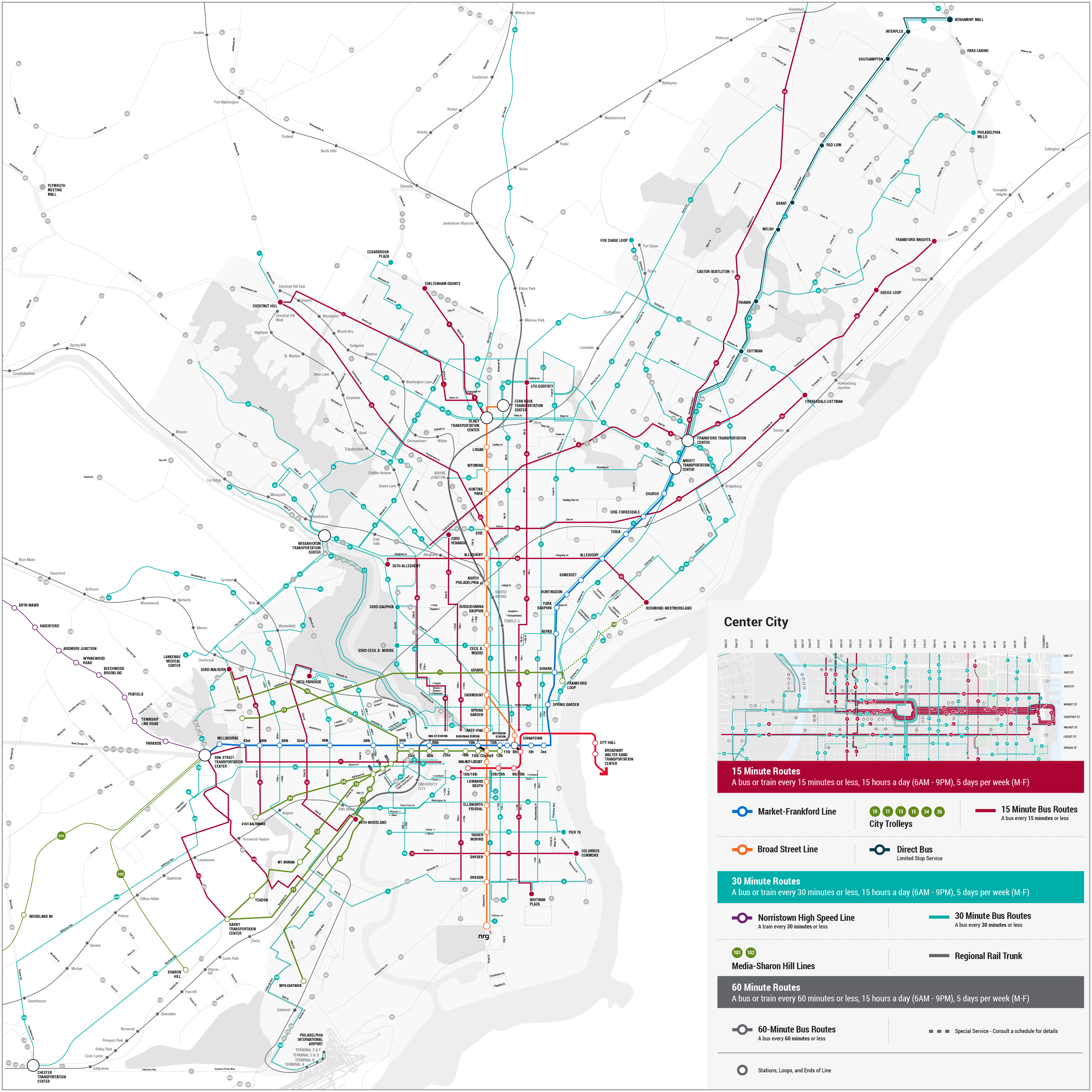
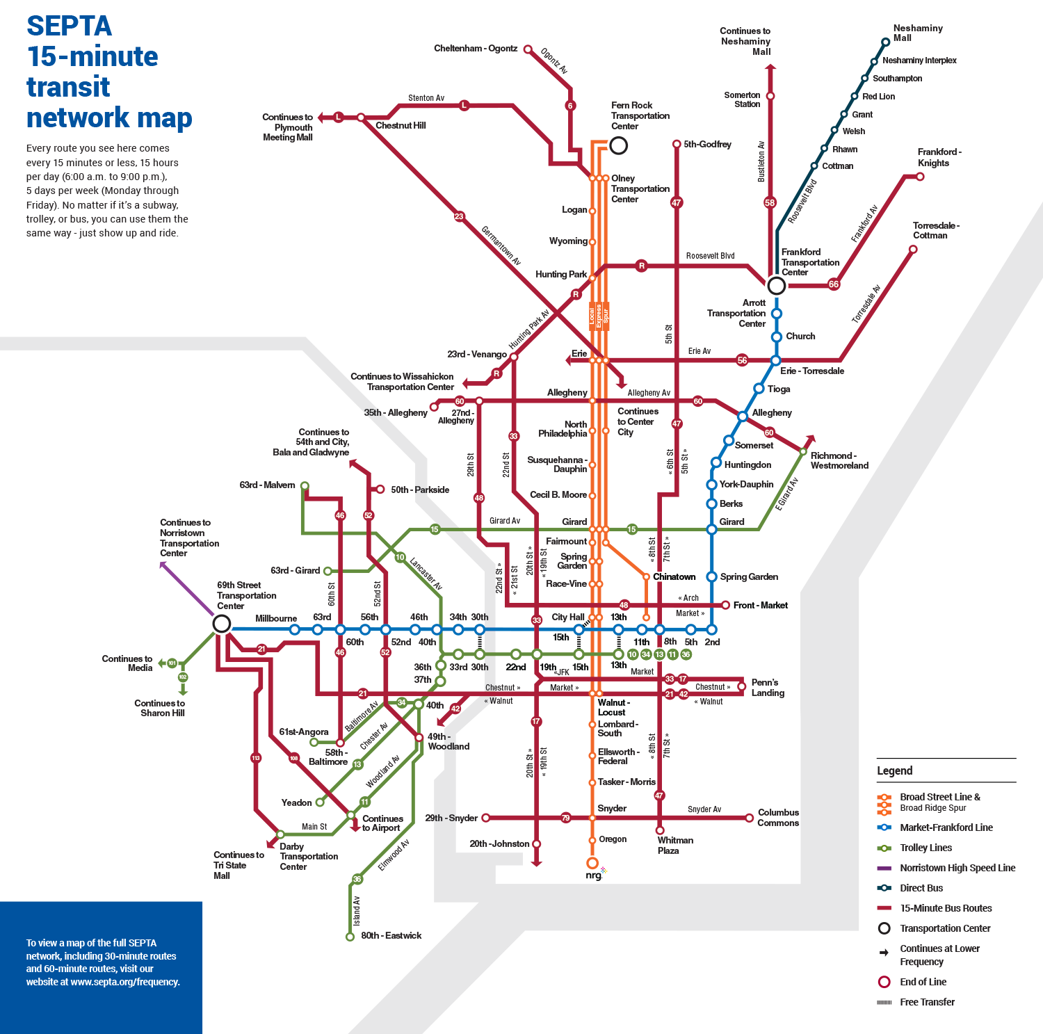
The Philadelphia Rapid Transit Timeline spans 145 years, three transit authority eras and four lines that qualify as rapid transit. The majority of development happened prior to World War II with 54 stations being opened before 1940. Since then, another 27 stations have opened, the majority of them being related to PATCO.

No station has opened since the Broad Street Spur’s Chinatown Station replaced Vine Street in construction necessitated by the building of the Commuter Rail tunnel in the 1980s.

Philadelphia’s Transit Plan vision for 2045 does include several projects that have been added to the timeline as proposals. Only the reopening of the Franklin Square station on the PATCO line seems guaranteed at this point.

Check out the timeline, and of course, let me know if you have any corrections or comments.

SEPTA Introduces Transit Map Tuesday

SEPTA is redesigning its transit maps and way-finding systems. As part of the effort, the transit authority is sharing some SEPTA maps done in the style of other transit systems from around the world in a feature they’re calling Transit Map Tuesday.

The work is evidently being done by SEPTA’s Strategic Planning intern and they have done a fine job through two weeks. For week one, the inspiration was the iconic Transport for London’s Tube map. That’s been followed up with Boston’s MBTA map, and includes frequent bus lines in addition to the rapid transit lines.

Continue reading

SEPTA Updates Frequency Map

Back in February SEPTA updated its bus map, attempting to show regional rail, subway, elevated rail, trolleys and buses all on the same map. Additionally the map showed frequency of bus transit via color and thickness of lines. SEPTA then asked for comment on the new maps to flavor the next round of maps.

Today, the transit agency released maps that took into account that feedback and some significant changes have been made.

The rail lines now more closely resemble the existing map and the Center City insert now includes the subway stops but still not the actual lines.

Personally I’d prefer the lines be represented on the inset but I do understand the attempt to streamline the amount of information shown.

SEPTA gets bold with new transit map [WHYY]
SEPTA Frequency Map v2 [png]

SEPTA Unveils Frequency Map

Just a little more than three years after a private citizen produced a frequent service map for SEPTA, the agency has a frequency map of its own. Coming on the heels of updating its frequent bus routes from 10 to 19 (buses with a headway of less than 15 minutes) the map is the agency’s first attempt at a newly styled bus map in decades.

It’s actually two maps that have been released. The first is a new system map showing the 80+ bus routes that connect with the city of Philadelphia. The most frequent routes are shown in red, the routes that run every thirty minutes or less are in teal and those that run every 60 minutes or less are denoted in gray.

The maps are posted to SEPTA’s website and a survey is provided for feedback. This is the latest step in SEPTA’s reworking of its bus network.

15-15-5 Networks [SEPTA]
Frequency Map [png]

Better Line Maps for SEPTA

The overall SEPTA system map has long been maligned as a “blobby mess.” Transit Maps gave the 2011 edition of the map a stinging one-and-a-half star rating.

SEPTA should feel lucky that no one has rated their line maps for the Broad Street line or Market-Frankford line. These are abominations in their own right. No consistency with the overall system map, confusing letters, colors and variable thickness in lines all gather to lessen the usability of the system.

Continue reading

© 2024 Greater PRT

Theme by Anders NorenUp ↑