With the recent re-re-opening of PATCO’s Franklin Square Station, it felt like a good time to revisit the Philadelphia Rapid Transit Timeline. I’ve updated the timeline to include Franklin Square’s reopening and added the proposed Roosevelt Boulevard Subway to the timeline. I’ve also made several corrections.
About a week ago, I came across a reddit post displaying the timeline of Washington DC’s Metro development. Needless to say, I set out to create a similar graphic for Philadelphia.
The Philadelphia Rapid Transit Timeline spans 145 years, three transit authority eras and four lines that qualify as rapid transit. The majority of development happened prior to World War II with 54 stations being opened before 1940. Since then, another 27 stations have opened, the majority of them being related to PATCO.
No station has opened since the Broad Street Spur’s Chinatown Station replaced Vine Street in construction necessitated by the building of the Commuter Rail tunnel in the 1980s.
Philadelphia’s Transit Plan vision for 2045 does include several projects that have been added to the timeline as proposals. Only the reopening of the Franklin Square station on the PATCO line seems guaranteed at this point.
Check out the timeline, and of course, let me know if you have any corrections or comments.
Before SEPTA released its new transit map in 2019, the transit agency did a series of what-if maps in the style of other worldwide transit agencies called Transit Map Tuesdays. Check them out below.
London
SEPTA Map in the style of London Underground
Boston
SEPTA Map in the style of Boston MBTA
Seoul
SEPTA Map in the style of Seoul Metropolitan Subway
Paris
SEPTA Map in the style of Paris
Los Angeles
SEPTA Map in the style of Los Angeles County Metropolitan Transportation Authority (LACMTA)
Tokyo
SEPTA Map in the style of Tokyo
Germany (Berlin, Köln, and Stuttgart)
SEPTA Map in the style of German Cities
New York
SEPTA Map in the style of New York Metropolitan Transportation Authority
This 1973 newspaper ad for Opening Night for the Phillies has always tickled my fancy. The Billy Penn statue sporting a glove and bat, the generic baseball player from an earlier time and even the fancy crosses (X marks the spot!) for the express stops on Broad Street line. Noticeably absent from the stations, Lehigh Avenue, which would have been the destination just three years prior when the Phillies called Connie Mack Stadium home. And not just an ad, this graphic includes lots of useful information, such as times to City Hall from 69th Street and Bridge Street, When the express trains leave Fern Rock. Important phone numbers that start with letters. Just don’t ask me what is up with the illustration of the Ben Franklin Bridge.
This was all brand new (well except for the Broad Street Subway train cars, SEPTA was still running cars from 1938 at the time), though this was the third season for Veterans Stadium and the Spectrum had opened in 1967, it wasn’t until opening day for the Phillies in 1973 that you could take the subway to Pattison Avenue.
Snyder Avenue had served as the southernmost station on the Broad Street Subway from its opening in 1938 till the 1973 when service was extended to Oregon and Pattison Avenue stations. The opening was a big deal with ribbon cuttings, special trains and even an appearance by the Phillies Hot Pants Squad!
Greater PRT started looking into the history of Philadelphia’s Subway Surface Subway lines, in part because the name itself will make your brain melt. From the city that gave you Street Road, of course there is a Subway Surface Tunnel that doesn’t carry subways, but trolleys. Are you following? Really? Because have you seen the maps? Below is the current trolley map which primarily shows the Subway Surface lines.
SEPTA’s current trolley line map including Subway Surface routes and the Route 15 Trolley on Girard Avenue
The map is bad. It’s busy, doesn’t convey any idea of where the trolleys run in the physical world, and if you wanted to connect to anything but the Market-Frankford Line, well good luck.
But short shrifting the trolley lines isn’t just a fault of the route line map. On the official SEPTA system map, subway-surface trolleys only rate a couple of arrows and some cramped text, representing five lines. Hardly appropriate for a system with more than 71,000 riders per weekday.
This isn’t exactly a new problem. SEPTA’s 1982 map wasn’t much better, though it did at least acknowledge that the trolleys did indeed run down streets.
Maps of Philadelphia transit throughout the years.
The SEPTA Era
1972 – Penn Central, Reading Railroad and SEPTA Lines
The Reading Lines sure get short shrift in their pale pink lines, but the map is certainly a clean look that feels very much of its time in the early 1970s. Lumping all of SEPTA in green makes it appear you could get a single seat ride from Bridge-Pratt (Frankford) all the way to Norristown. If only! PATCO appearing in black is also an interesting choice. As is whatever this map came from that cost $3.95 in 1972.
1974 – Rapid Transit and Rail Commuter System
This map introduces some colors we’re still very familiar with today. The Market-Frankford Line is rendered in blue, the Broad Street Line in orange and even the Norristown High Speed Line in purple. The Reading and Penn Central lines are in shades of green but fairly easy for at least a non-color blind person to differentiate. Service extends out to far flung destinations like Pottstown, Quakertown and even continuing service from West Trenton to Newark. AMTRAK shows up on the map, but only in parenthesis following Penn Central descriptions.
1976 – High Speed and Rail Commuter System
This 1976 SEPTA map appears to be a black-and-white version of the 1974 map above. SEPTA’s High Speed lines and PATCO are in black and commuter lines run by Penn Central and the Reading Railroads are displayed as an outline.
1979 – Rapid and Commuter Rail System
Below is a modern redrawing of the 1979 SEPTA map drawn by Lucius Kwok of Felt Tip Software. As Cameron Booth of Transit Maps notes, the map is quite faithful to the original and compared to the “blobby mess” that succeeded it, this map is indeed “gorgeous.”
1984 – General Operations Plan for the SEPTA Regional High Speed System
This map predates the opening of Market East Station, though it does show it under construction. Also coming soon, the Airport line. This map also shows SEPTA service to diesel destinations like West Chester and Newtown.
1984 – SEPTA High Speed System
This is one of the earliest maps to feature Market East Station and the Center City Commuter Tunnel. There are several items to note regarding this particular map. The map shows proposed 70th and 84th Street Stations on the Airport line. It also shows bus substitution between Fox Chase and Newtown.
1986 – SEPTA Regional Rail Lines
By 1986, SEPTA was experimenting with coloring the regional rail lines. The line colors matched the train destination placards and other signage for the lines. This is the first map I’ve come across that includes the R1-R8 designations. The three Center City stations are denoted as large octagons and the common lines that run through all the stations and northward to Glenside are shown in gray. And since nothing is ever really original, it is interesting to see this design choice basically mirrors the “Silver Line” concept from the City of Philadelphia’s Transit Plan for 2045.
2001 – SEPTA Railroad and Rail Transit
This 2001 map includes all of SEPTA’s rail transit, including subways, trolleys, regional rail and even PATCO. This version of the map shows regional rail lines in black with destination points in the colors of the various regional rail lines. A couple anomalies to note on this map. The R5 circle at Thorndale seems to have taken off for Harrisburg on the map. And the PATCO line shows as an outline when underground, and a solid line when above ground. This design element doesn’t seem necessary and isn’t carried over to the Broad Street Line or Market-Frankford Line.
2010 – SEPTA System Map
Not much changes between 2001 and 2010 in the SEPTA maps. The regional lines go from gray to gray-blue and the Delaware County trolleys go from brown to green, matching the city trolleys. Also, the Route 15 trolley has been shoehorned into the map, further cluttering the whole thing.
2015 – Papal Visit Map
In 2015, the Pope came to town and to accommodate the expected masses, SEPTA reduced the number of entry points into the system. This map was released to show where you could still get aboard regional rail or the subways and elevated trains. Not sure if this was helpful to anyone.
2019 – SEPTA High Frequency Map
Looking to showcase the transit agency’s 19 frequent bus routes, this SEPTA map adds buses with at less than 15-minute headways to its transit maps. It also is SEPTA’s first map release exiting the “blobby mess” era. It is also, a city specific schematic map as it doesn’t show PATCO or Regional Rail lines or stations at all.
2019 – SEPTA Transit Network Philadelphia and Vicinity
The release of the High Frequency map was only the first map SEPTA released in 2019. The SEPTA Transit Network for Philadelphia and Vicinity showed all bus routes. Regional Rail lines are there but very de-emphasized into a thin gray line. It is interesting to note that the two 2019 maps differ in how they show station stops and that the vicinity map is a geographic map, while the high frequency map is strictly schematic.
2021 – SEPTA Metro System Map
In 2021, SEPTA unveiled its Metro plan. It featured an overhauled visual identity program, unifying all of the rapid transit lines under the Metro name and committing to showing one line to represent one service pattern. Particularly interesting about this map, it is the first time the King of Prussia extension to the Norristown High Speed Line appears on an official map.
2023 – SEPTA Metro Network Map
By late 2023, SEPTA continued to enhance the Metro branding and began rolling out the below map online and in some stations.
SEPTA is redesigning its transit maps and way-finding systems. As part of the effort, the transit authority is sharing some SEPTA maps done in the style of other transit systems from around the world in a feature they’re calling Transit Map Tuesday.
The work is evidently being done by SEPTA’s Strategic Planning intern and they have done a fine job through two weeks. For week one, the inspiration was the iconic Transport for London’s Tube map. That’s been followed up with Boston’s MBTA map, and includes frequent bus lines in addition to the rapid transit lines.
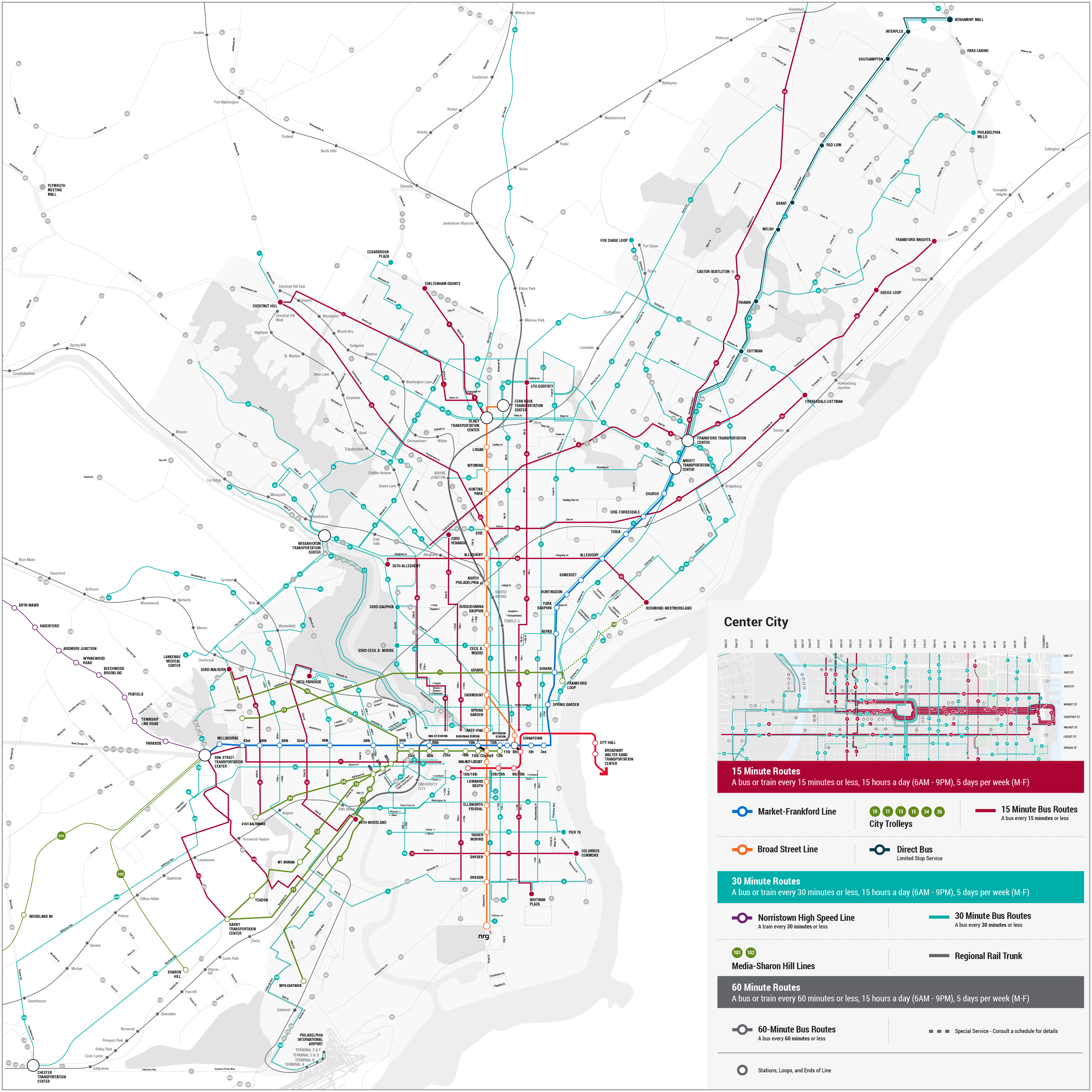
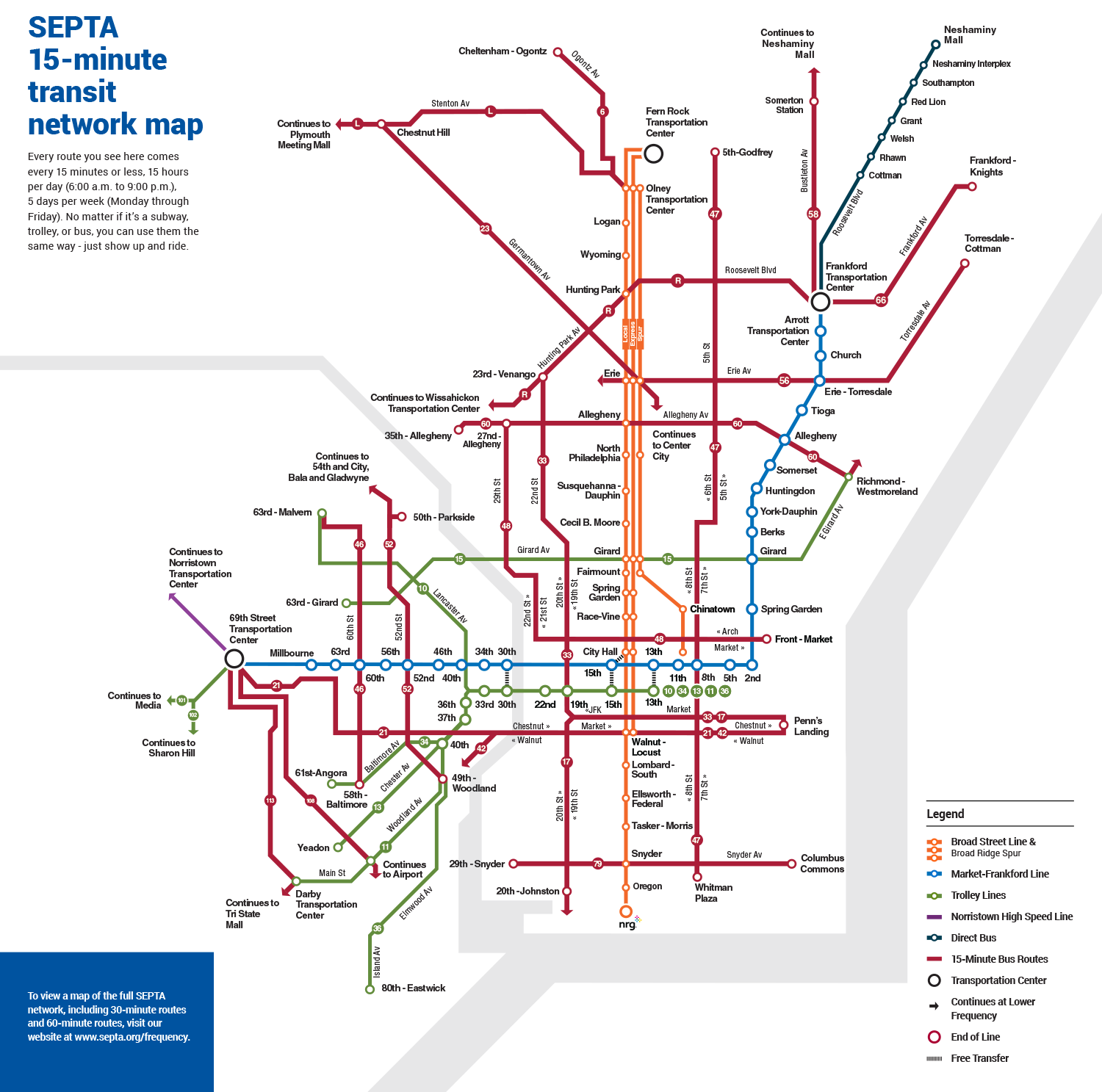
Back in February SEPTA updated its bus map, attempting to show regional rail, subway, elevated rail, trolleys and buses all on the same map. Additionally the map showed frequency of bus transit via color and thickness of lines. SEPTA then asked for comment on the new maps to flavor the next round of maps.
It’s actually two maps that have been released. The first is a new system map showing the 80+ bus routes that connect with the city of Philadelphia. The most frequent routes are shown in red, the routes that run every thirty minutes or less are in teal and those that run every 60 minutes or less are denoted in gray.
The maps are posted to SEPTA’s website and a survey is provided for feedback. This is the latest step in SEPTA’s reworking of its bus network.
The overall SEPTA system map has long been maligned as a “blobby mess.” Transit Maps gave the 2011 edition of the map a stinging one-and-a-half star rating.
SEPTA should feel lucky that no one has rated their line maps for the Broad Street line or Market-Frankford line. These are abominations in their own right. No consistency with the overall system map, confusing letters, colors and variable thickness in lines all gather to lessen the usability of the system.


You must be logged in to post a comment.